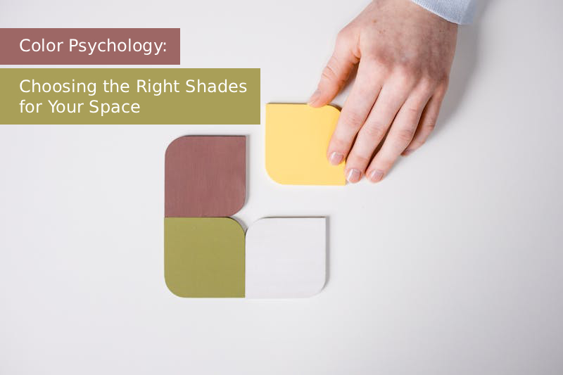
Ever Walked Into a Room and Just Felt Something?
You know that feeling when you walk into a cozy café painted in warm tones and instantly feel relaxed? Or when you step into a sleek office filled with whites and blues and suddenly feel focused?
That’s color psychology in action — the science (and art) of how colors affect our emotions, thoughts, and energy.
Choosing the right shades for your space isn’t just about aesthetics — it’s about designing an environment that matches your mood, goals, and personality. Let’s explore how you can use color psychology to turn your home into a place that feels just right.
💛 1. The Science Behind Color Psychology
Colors have a deeper connection with our brains than we realize. Studies show that certain hues can influence emotions, productivity, and even appetite.
Here’s a quick look at how colors affect us:
- Warm colors (Red, Orange, Yellow) → Energize, stimulate, and create warmth.
- Cool colors (Blue, Green, Purple) → Calm, relax, and promote focus.
- Neutrals (White, Gray, Beige) → Balance, clarity, and sophistication.
🧠 Fun fact: Fast-food chains often use red and yellow because they trigger hunger and excitement!
🏡 2. Choosing Colors Room by Room
Your home is a mix of moods — your bedroom isn’t your kitchen, and your study doesn’t need to feel like your living room. Each space deserves its own emotional tone.
🛏️ Bedroom – Soft and Soothing
This is your sanctuary. Think soft blues, gentle greens, or muted lavenders. These shades calm the mind and promote restful sleep.
💡 Avoid: Bold reds or bright yellows — they can be too stimulating before bedtime.
🍽️ Dining Room – Warm and Inviting
Warm tones like terracotta, soft orange, or gold create a cozy and welcoming vibe — perfect for sharing meals and laughter.
💡 Tip: Earthy tones pair beautifully with wooden furniture.
🧠 Home Office – Focus and Flow
Need focus? Cool blues and neutral grays boost concentration without feeling harsh.
💡 Bonus: Add a touch of green — it’s known to enhance creativity and reduce eye strain.
🛋️ Living Room – Energy Meets Comfort
Balance is key. Mix warm and cool tones — maybe beige walls with navy cushions or olive-green accents with warm lighting.
💡 Pro Tip: Use accent walls to experiment with bolder shades.
🎨 3. Understanding Color Moods: What Each Shade Says
Here’s how some of the most common colors can shape the mood of your space:
| Color | Emotion / Effect | Best For |
|---|---|---|
| Blue | Calm, focus, trust | Bedroom, office |
| Green | Growth, balance, freshness | Living room, kitchen |
| Yellow | Optimism, warmth, energy | Kitchen, dining area |
| Red | Passion, excitement, confidence | Accent wall, dining room |
| White | Purity, openness, simplicity | Any small or dark space |
| Gray | Modernity, neutrality, calm | Office, living room |
| Pink | Compassion, playfulness | Bedroom, nursery |
💬 Question to ask yourself: How do you want to feel when you walk into that room every morning?
🖌️ 4. Tips to Pick the Perfect Palette
Choosing a color scheme doesn’t have to be overwhelming — just follow a few smart steps:
- Start with a base color: Choose one main tone that defines the space.
- Add an accent color: Use this on one wall or through decor (like cushions or rugs).
- Balance with neutrals: They keep your space from feeling too busy.
- Test before committing: Paint small patches and observe under natural and artificial light.
🌤️ Lighting changes everything! A shade that looks dreamy in daylight might feel dull under warm bulbs.
🖼️ 5. Using Decor to Reinforce Mood
You don’t need to repaint your entire house to use color psychology. You can express it through:
- Curtains, cushions, and rugs
- Wall art or photographs
- Plants and accessories
- Lighting fixtures and lampshades
Even small pops of color can dramatically shift a room’s vibe. Imagine a neutral room brightened by a mustard-yellow throw blanket — instantly happier, right?
💫 Conclusion: Paint Your Emotions
Your home should tell your story — through color, comfort, and character. Whether you crave calm blues, energizing reds, or cozy neutrals, every shade has the power to shape how you feel and live.
So, the next time you pick up a paintbrush or redecorate, don’t just ask “What looks good?”
Ask, “How do I want to feel here?”
Your colors will answer.
